I’m playing around with some new WordPress themes. We have been using the same Misty Look theme for about a year now. Good Luck is from the same designer.
Do you prefer the current theme or the old one? If we keep the current theme, I will change the color of the purple links to the color we use on the other theme. Need some feedback here.
Note: Any suggestions of new banner images would be appreciated. I am kind of tired of School of Athens.
The text in the two outer columns doesn’t quite look right to me. I am on a Linux system that displays fonts differently than on Windows. If I increase or decrease the font size by one the aliasing effect kicks in and they look much better.
“Any suggestions of new banner images would be appreciated. I am kind of tired of School of Athens.”
We need a photoshop of General Lee shooting Hitler in the back of the head. It’s edgy, it projects virility, it shows we hate Nazis but are not opposed to enslaving niggers, er, I mean African-Americans.
I second Jacob’s concern about the text in the columns, and am on an XP box. In general, though, this is nice.
I think you should put some serious thought in to theming your site far beyond merely “mixing up the logo”. You should settle on a logo, a color palette, and some sort of slogan. I would go for a 50’s cigarette advertisement kitsch theme, but I know that’s not you. Maybe you could ask Kurtagic for help. He has a good sense of style which is probably closely matched to you and the majority of the readership.
For a new banner image, how about “The Wedding Feast at Cana” by Paolo Veronese, or Benjamin West’s “The Death of Wolfe,” maybe a work by John S. Copley or for something more recent, Natalia Pierandrei.
A shot of one of Arno Breker’s sculptural groups would be nice.
It occurrs to me wether I surf google or tour the University art museum that most modern “art” is utter jewed shit.
Firstly, I gotta say I love the Captain.
Secondly, the “recent comments” being on the upper left and visible immediately really facilitates easy navigation.
Also, Rusty Mason’s blog is gone so you might wanna change the link to his homepage here: http://www.rustymason.com/
What about a nice painting of Monticello? Jefferson sorta bridges the gap between Christians, Southerners, agrarians and philosophers.
The back of a two dollar bill? http://upload.wikimedia.org/wikipedia/commons/b/b1/US_$2_reverse.jpg
Of course, without all the twos and watermarks and whatnot.
http://www.dpiw.tas.gov.au/inter.nsf/Images/PCOX-7GD8YH/$File/marsupial-panorama.jpg
I like this one; but to be truthfully honest, I’m not too fond of free templates. The styling issues have always bugged(no pun intended) the hell out of me. Though I’ve never used WordPress, I have used Joomla and Drupal extensively, and there’s always a great selection of theme club options.
Proposition: Why not start a poll on the Forum, put up a dozen or so premium pre-made themes for everyone to vote on, and see what happens from there.
Just a friendly suggestion.
How about the famous painting of David, “Oath of the Horatii”
From the wiki entry about the painting:
“In the painting, the three brothers express their loyalty and solidarity with Rome before battle, wholly supported by their father. These are men willing to lay down their lives out of patriotic duty. In this patriarchal society, the steely men, with their resolute gaze and taut, outstretched limbs are citadels of republican patriotism. They are symbols of the highest virtues of the Republic, while the tender-hearted women lie weeping and mourning, awaiting the results of the fighting.”
Oath of the Horatii can be viewed here:
http://paulthompson.us/blog/wp-content/uploads/2008/12/david-oath_of_the_horatii-1784.jpg
The theme suggestions are all good.
Cap’n,
Why have you been so butt hurt lately?
I like the new theme. And I’ve grown very fond of the painting you are currently using. (It’s in the papal apartments in the Vatican, which I find ironic.)
It would be nice to have the sub-theme underneath it so as not to obscure the faces of all the masters.
I like this new theme. The text is bigger, and therefore easier to read.
I’m still not convinced on that the mission statement of a “Jew Free Ethnostate” top and center serves any purpose besides driving the weak knees away. Perhaps that is the intent.
When I posted many questions on the topic the answers (from Hunter) were much more moderate than the phrase suggests. Also, it strikes me that this site isn’t really about that. (Say, in the way that the Northwest Front site is.)
It really is about “Western Racial and Cultural Preservation”, mostly.
LOL, I vote for Soren’s suggestion. I confess to be more privy to the old theme myself.
This theme is an improvement, or at least a refreshing change.
I’d like to see comment numbering restored.
My archaic computer finally ground to a halt (corrupt registry) and I’m trying to resuscitate it, so I haven’t been online in the past couple of days. If you have e-mailed me and not received a response, that is why.
Thanks to Matt and Kievsky for assistance.
I agree with the first comment, the side text needs a larger, sans serif font.
I like the ancient world type theme, please no norse gods, confederate, or hitler stuff up there. Go for Michaelangelo or some renaissance theme that suggests academia. Or Jan Sobieski saving Vienna. The whole “neo-pagan” cult amongst some in the racialist scene is a turnoff for the vast majority of Americans, mainly for the reason that no one believes anyone could sincerely believe in “Thor” these days and the whole thing is just play acting. As silly as I personally think Christianity is, at least I believe that Christians are sincere in their belief. But how could someone raised in America actually believe in “Wicca” “Gai” or whatever silliness that the “neo-pagan” revival purports. People do judge the message by the messenger and some stuff just doesn’t sell.
This may be more appropriate for Majorityrights.com but I’m sure soren renner will get a tingle up his leg over this one:
http://i.ytimg.com/vi/AkquVGE8jpE/0.jpg
My archaic computer finally decided to crash, so I haven’t had access to the internet over the last couple days. If you’ve e-mailed me recently and haven’t received a reply, that is why.
I am still trying to restore my system. Thanks to Kievsky and Matt for their assistance in that regard.
Robert,
Where is that comment number plugin again?
The more business like, the more traffic.
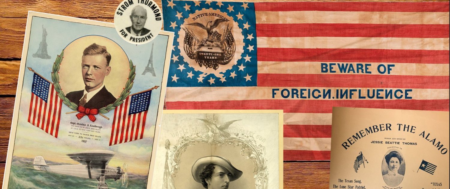
Agree that OccDiss needs a new banner. What’s there now is just plain turgid. Instead, something modern, relevant, or at least non-archaic. Something eye-catching, maybe art-deco, with bright, clashing colors and sharp angles, that’ll get people into the site. A visual, right-wing thematic. Something really basic, that evokes sex and/or food, also violence. WN imagery. A white army victorious, like Americans storming Chapultepec during the war vs. Mexico. Or something from our more recent race-war vs. Japan. Maybe a Lindbergh theme….like a photo or artwork of him giving one of his America First, anti-interventionist addresses, or taken during his speech attacking the Jewish warmongers. Or some kind of Whites vs. Jews/Mexicans/blacks newsphoto.
“Maybe a Lindbergh theme….like a photo or artwork of him giving one of his America First, anti-interventionist addresses, or taken during his speech attacking the Jewish warmongers.”
Just put up the awesome A3P banner and be done with it. Lindbergh is the best icon for us, and the style of the A3P banner hits the classic/modern angle perfectly.
Whoever made that banner should get a raise. Also, the Gadsden flag is great.
A picture more militant and less cerebral might be something to try. “Oath of the Horatii” is good. I also like the idea of a battle scene from the Mexican wars, Chapapultec or the Alamo. Those were the last good wars for us.
If you want to go back further, the defense of Vienna is a good idea, or maybe the naval battle of Lepanto.
Captain Chaos: Why would General Lee Shoot Hitler in the back?
“the defense of Vienna is a good idea, or maybe the naval battle of Lepanto. ”
I like these suggestions; and, another idea would include Charles Martel at the Battle of Tours, or Charlemagne in his court.